
Work

The TARIFF Project
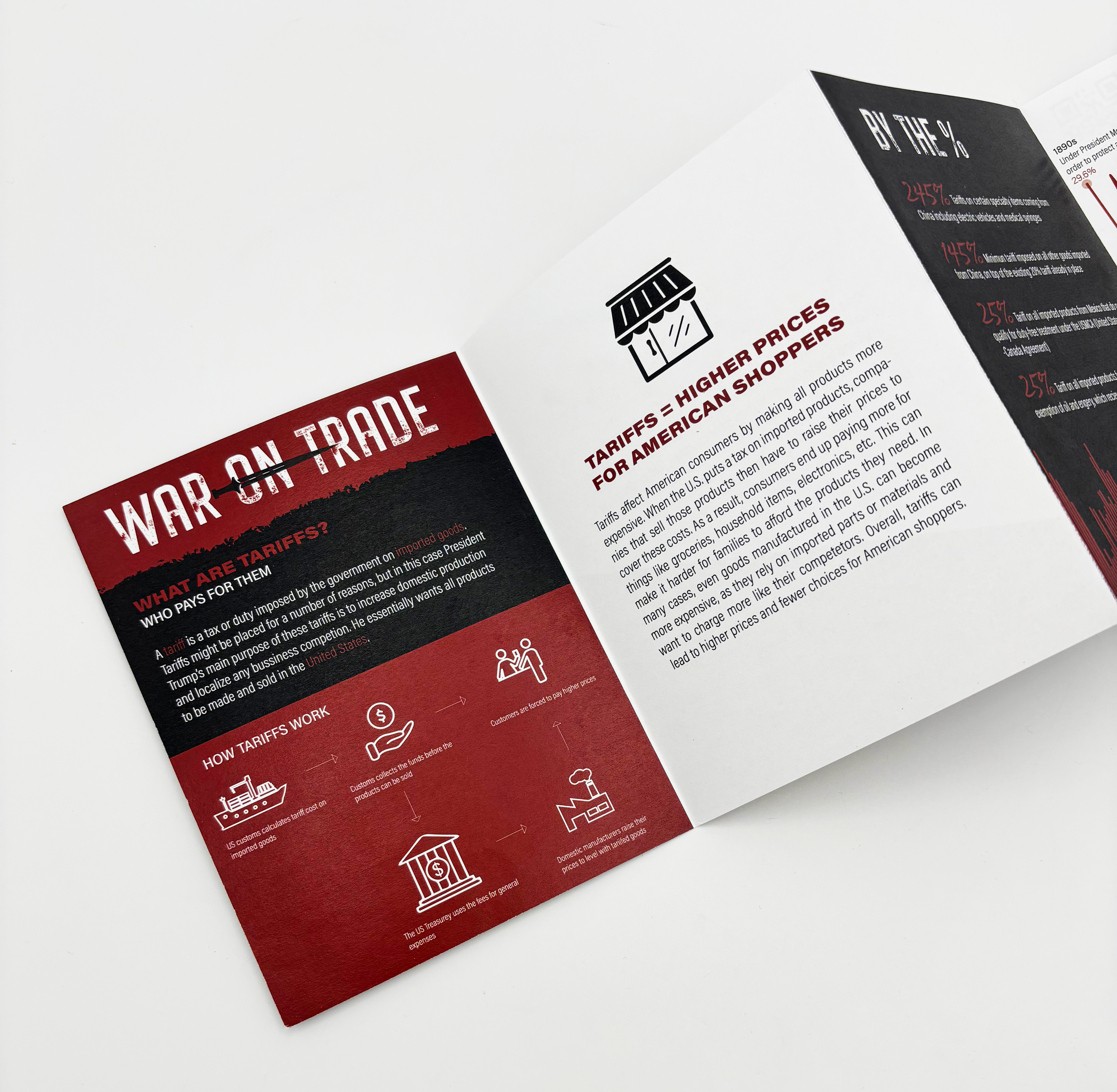
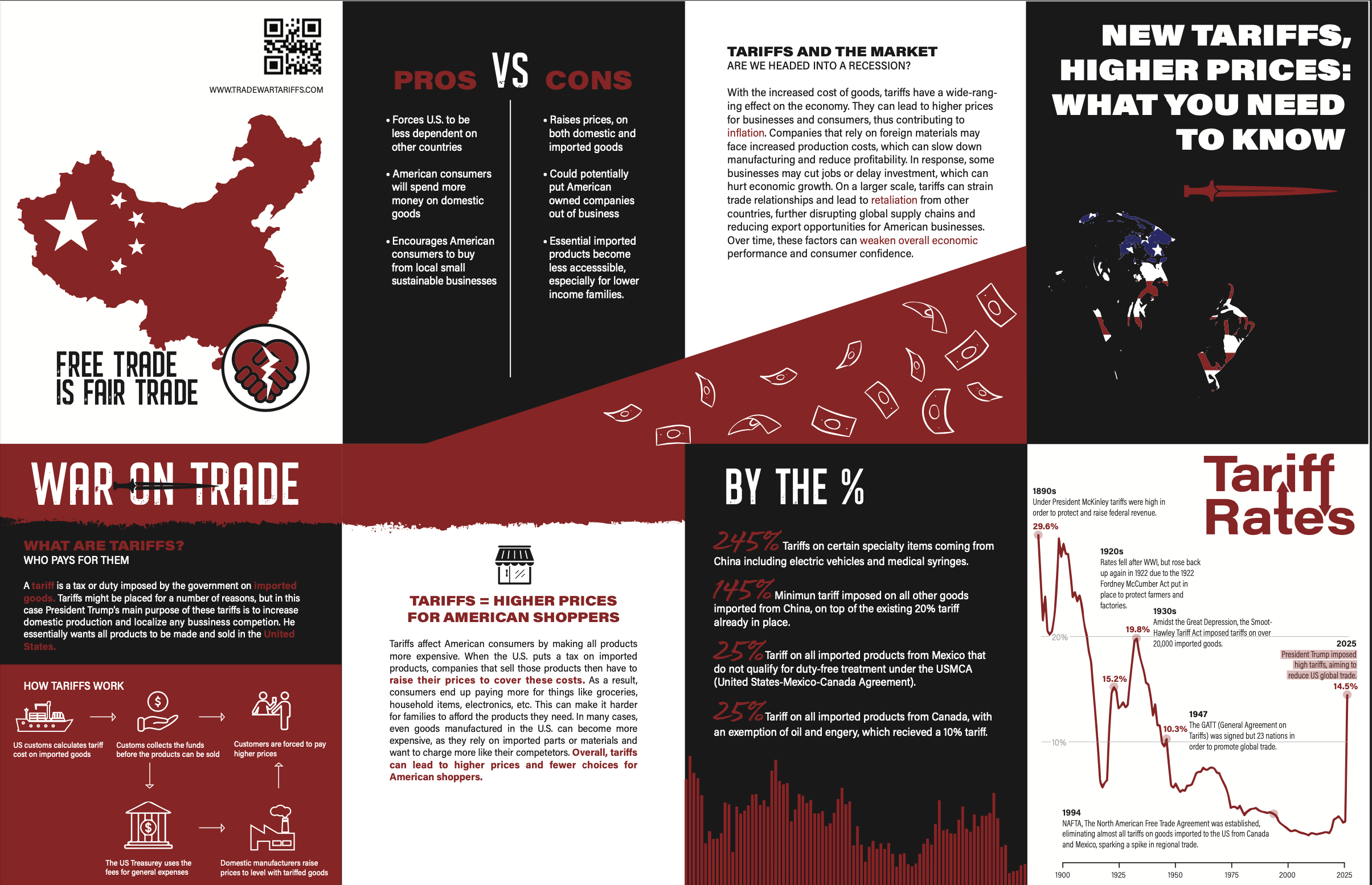
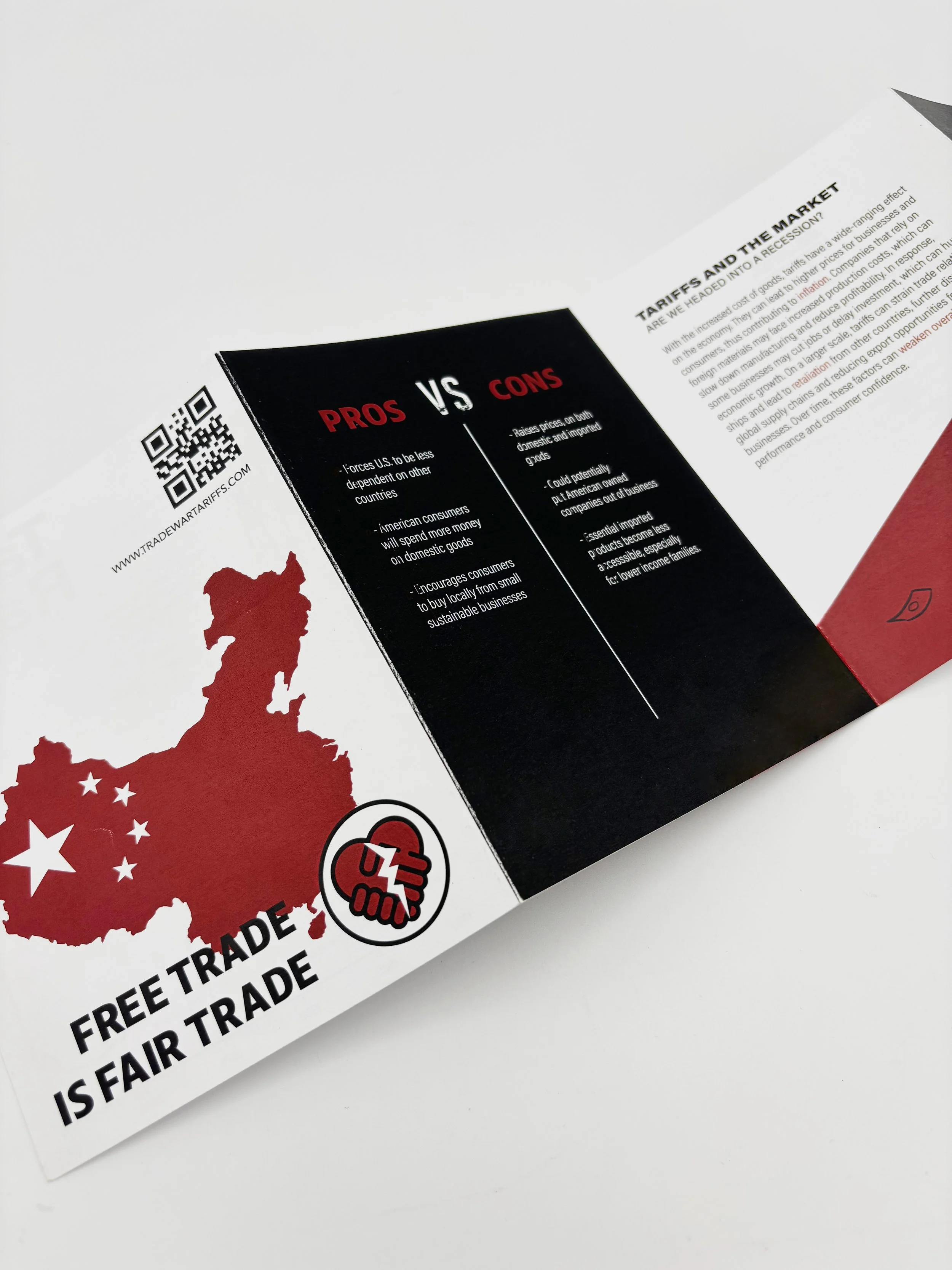
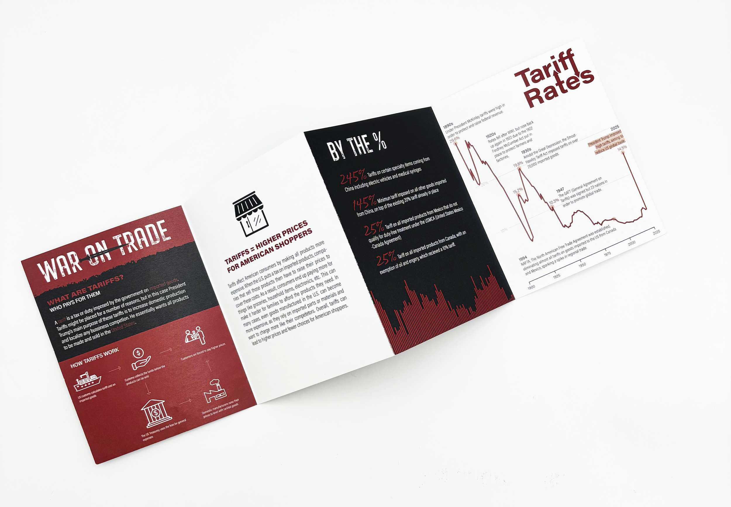
War on Trade Brochure and Pins
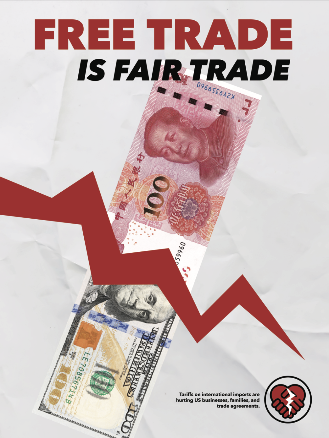
This is an informational brochure about the war on trade and rising tariff prices. For this project I wanted to keep a more serious feel throughout the work, for it is a serious topic that has effected many people. I used clean and easy to read typefaces as well as dark colors in contrast with white to keep it easy to read. For it is an informational brochure, I wanted to focus on iconography and type rather than images.
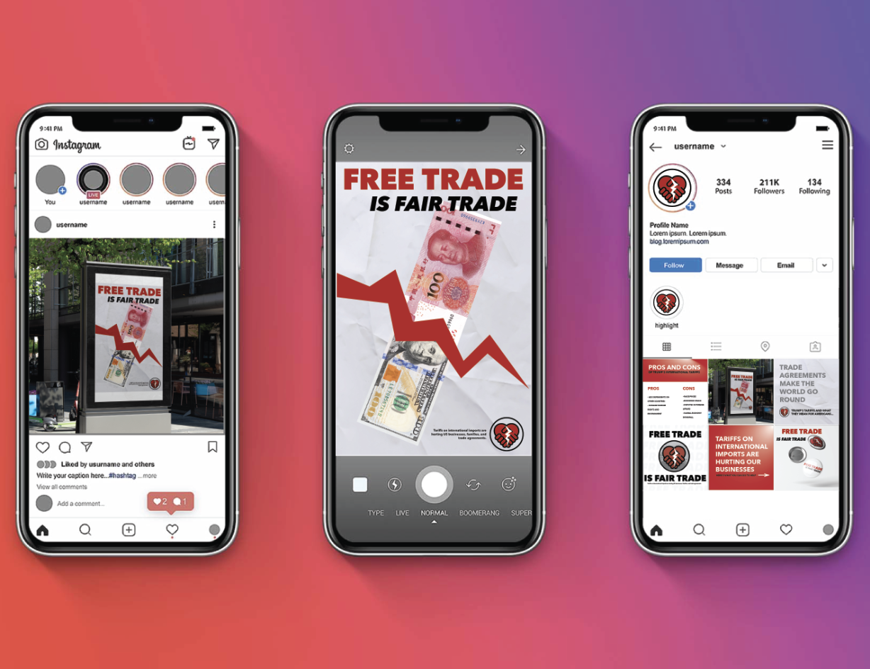
Full layout front and back before print and social media layout
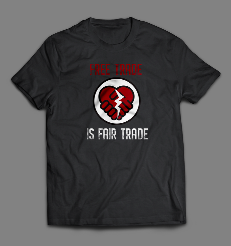
Promotional Items and Poster
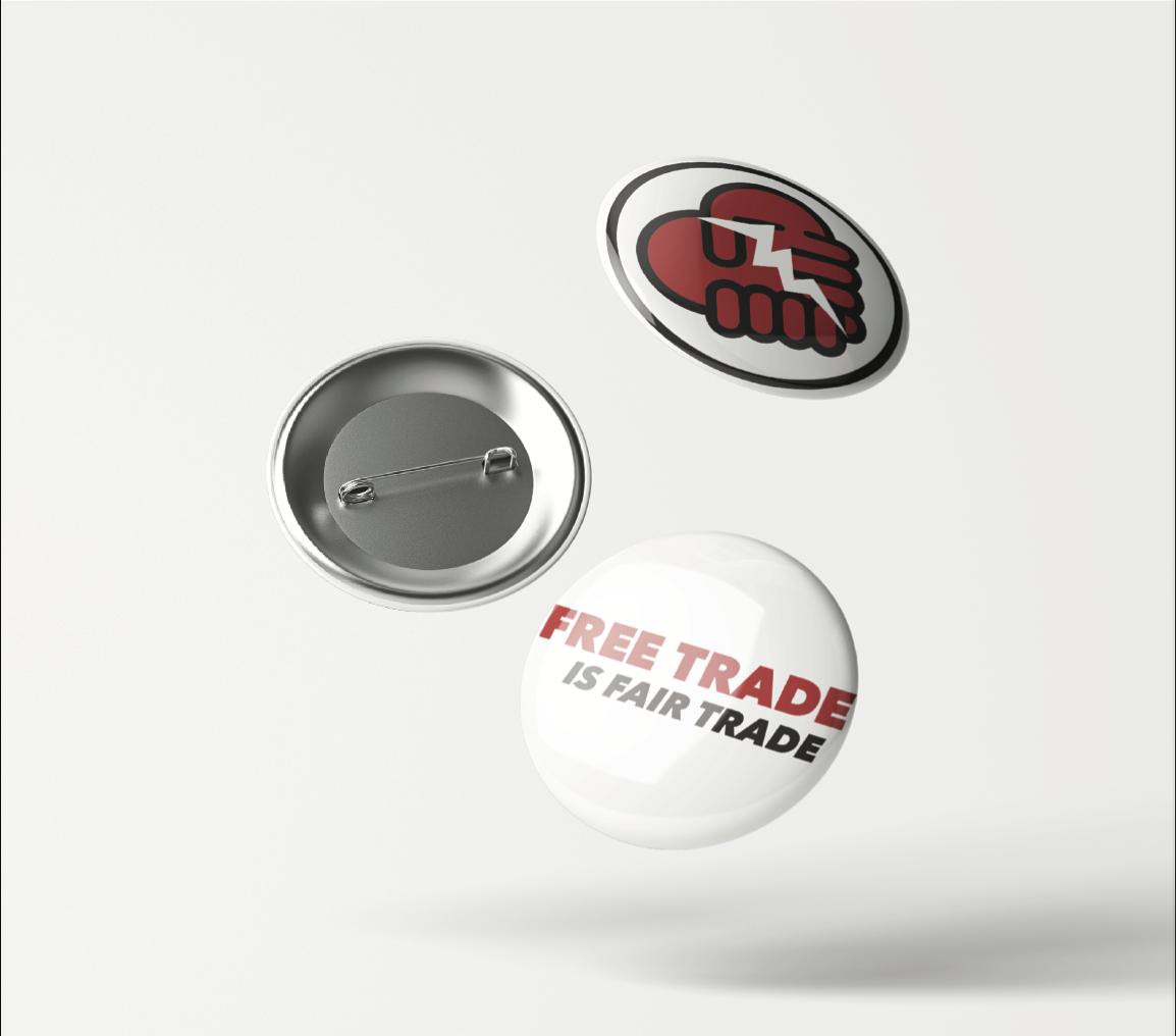
I chose to make buttons and a T-shirt alongside my brochure and poster as promotional items for this campaign.
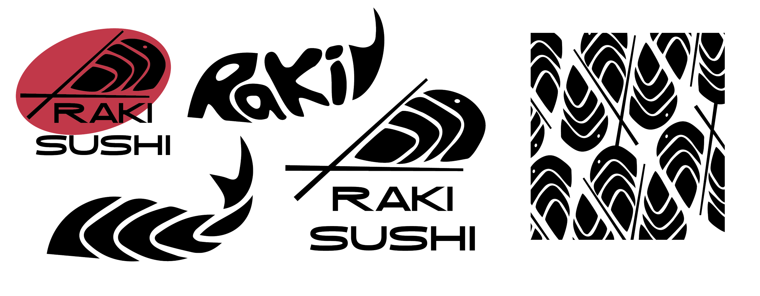
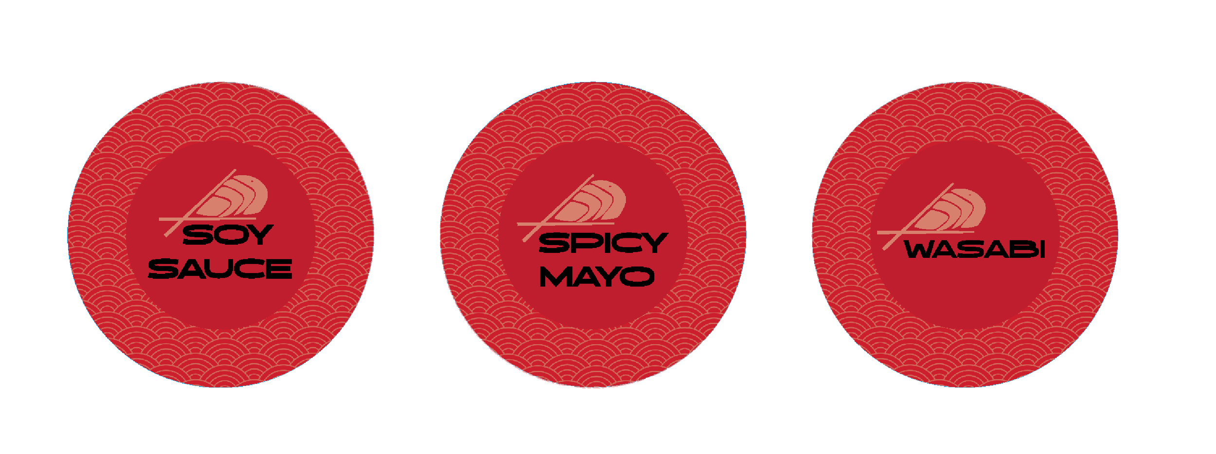
Logo development and sauce container stickers.
For the logo for this project I wanted to incorporate the idea of the marbling on a fish fillet. To the right are some of the iterations and patterns I came up with considering this idea. I went through a lot of designs when making this logo, but ended up landing on the one in the middle. I wanted to consider the whole one plus one equals three idea, so I made the chopsticks act as a tail as well as make it look like they are picking up the sushi.
Below are stickers I made to label the to go sauce containers. I used the same traditional Japanese pattern I used in the menu to keep consistent branding throughout.

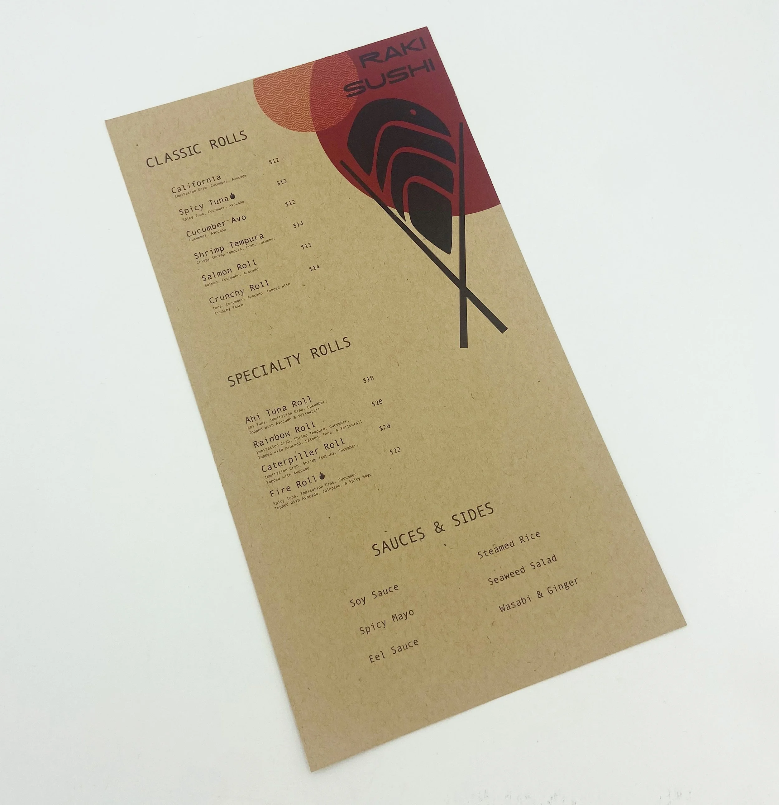
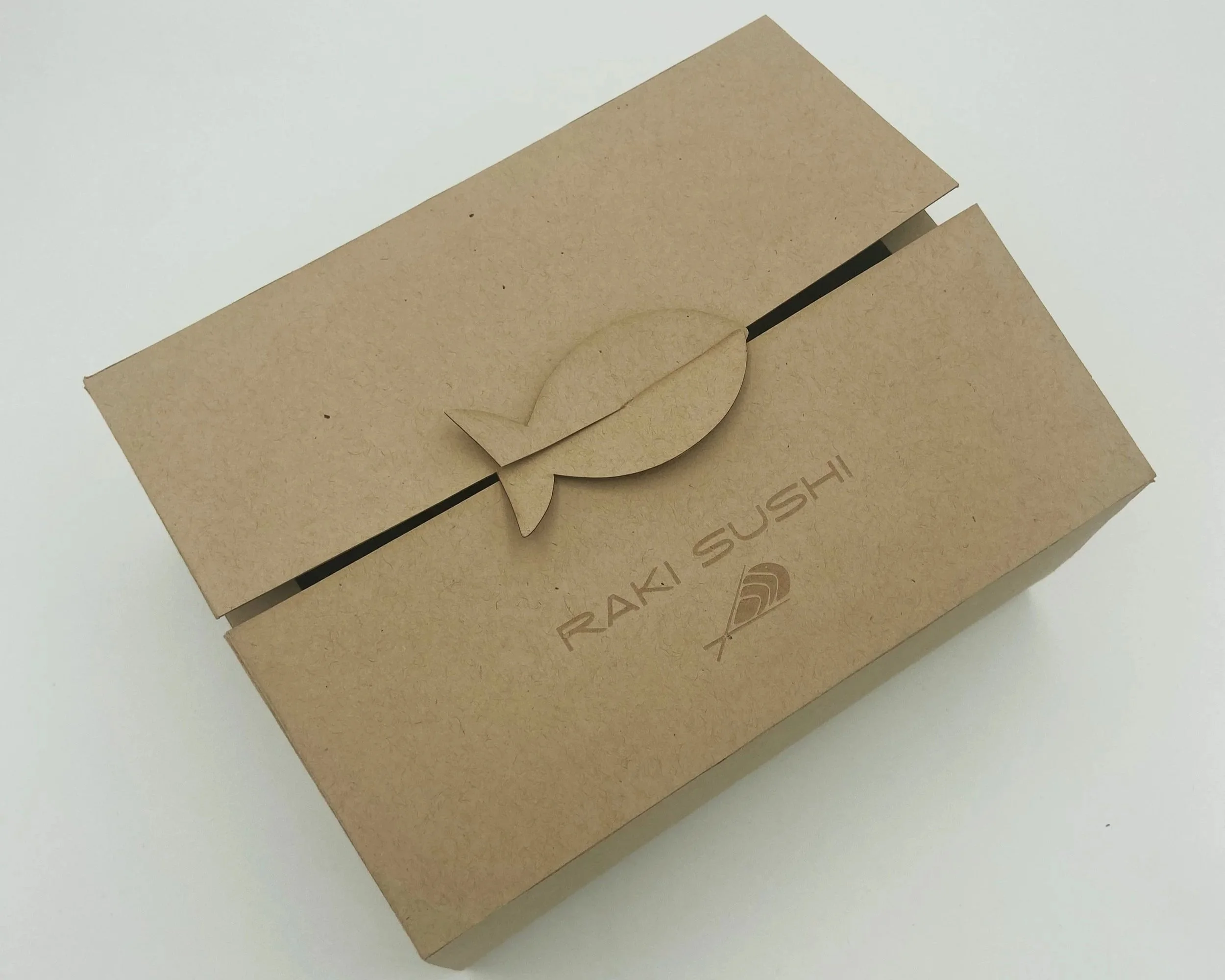
Eco Friendly Sushi Take out Packaging
The idea behind this project was that the packaging is eco friendly and made of recycled materials. I chose to keep the raw cardboard color and have the logo laser engraved to really communicate this. I took inspiration from traditional Japanese style and patterns, but put a modern and simplistic twist on it.
Alongside designing the box, I also designed a menu and label stickers for the sauces containers.
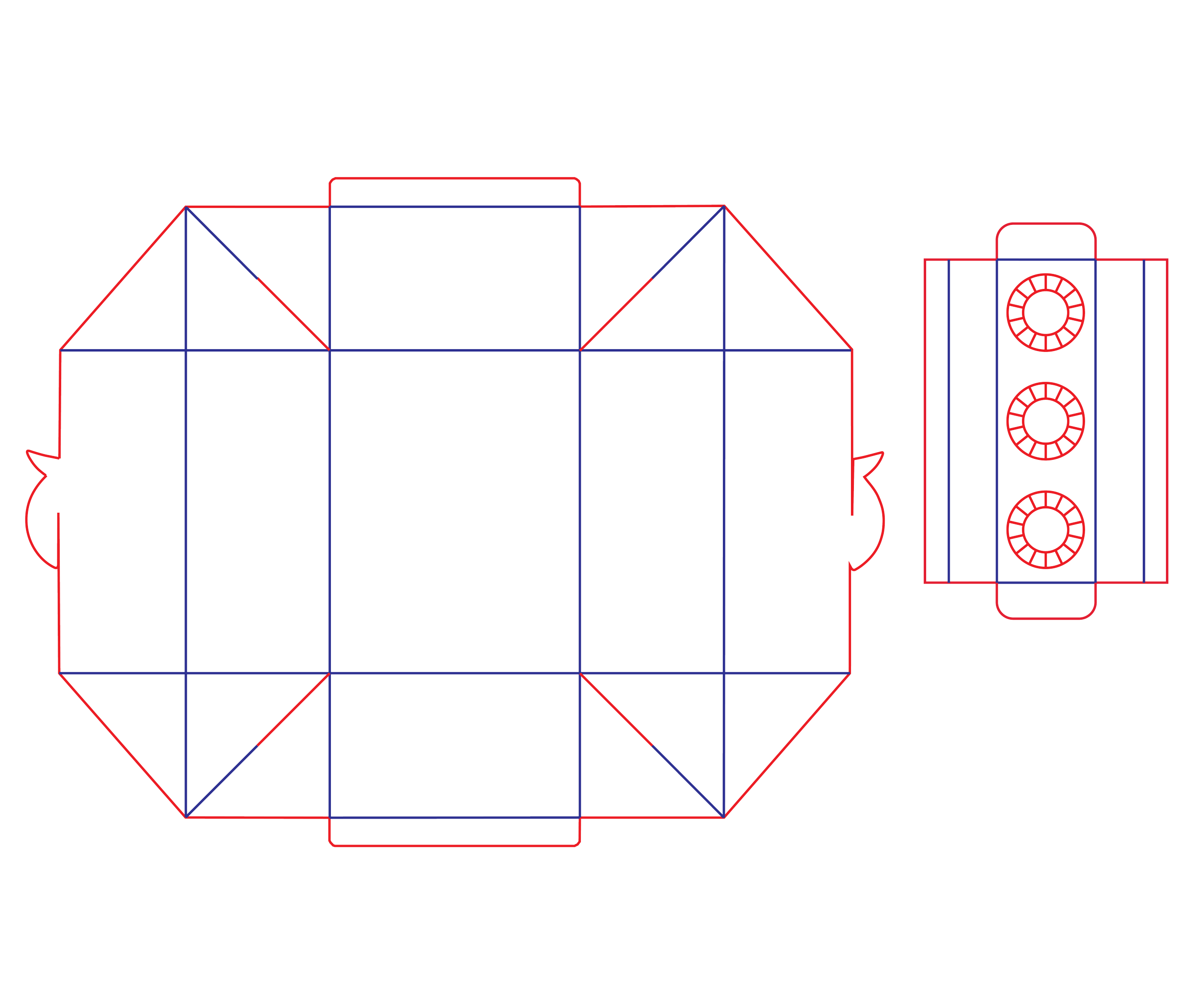
Packaging design
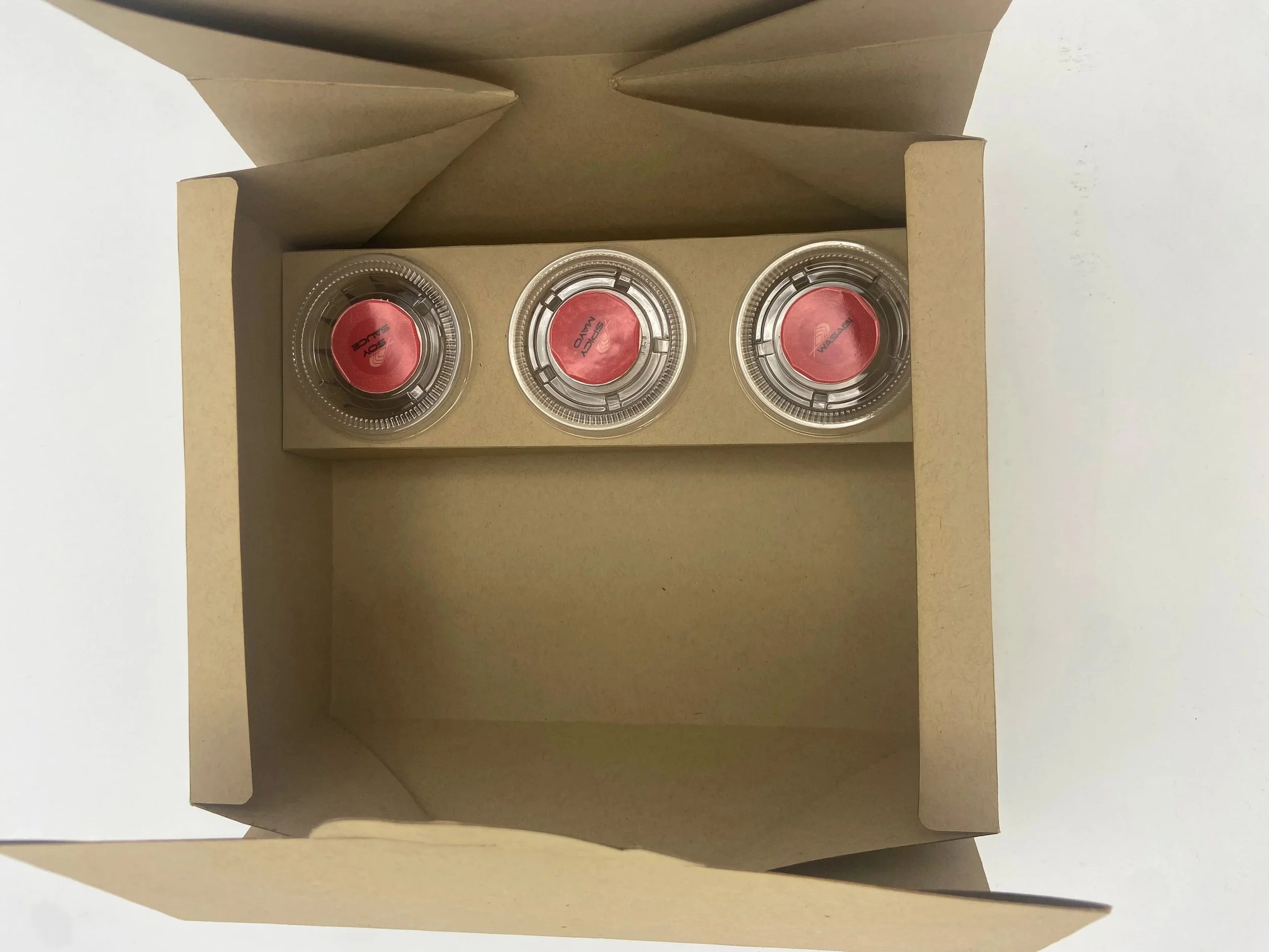
I had to design a custom dye outline for the box as well as an insert for the sauce containers to sit in. I then took this to the laser cutter and it cut and scored the intended lines. This was something that was new to me, but I really enjoyed. and would love to do more of in the future.
Collage work
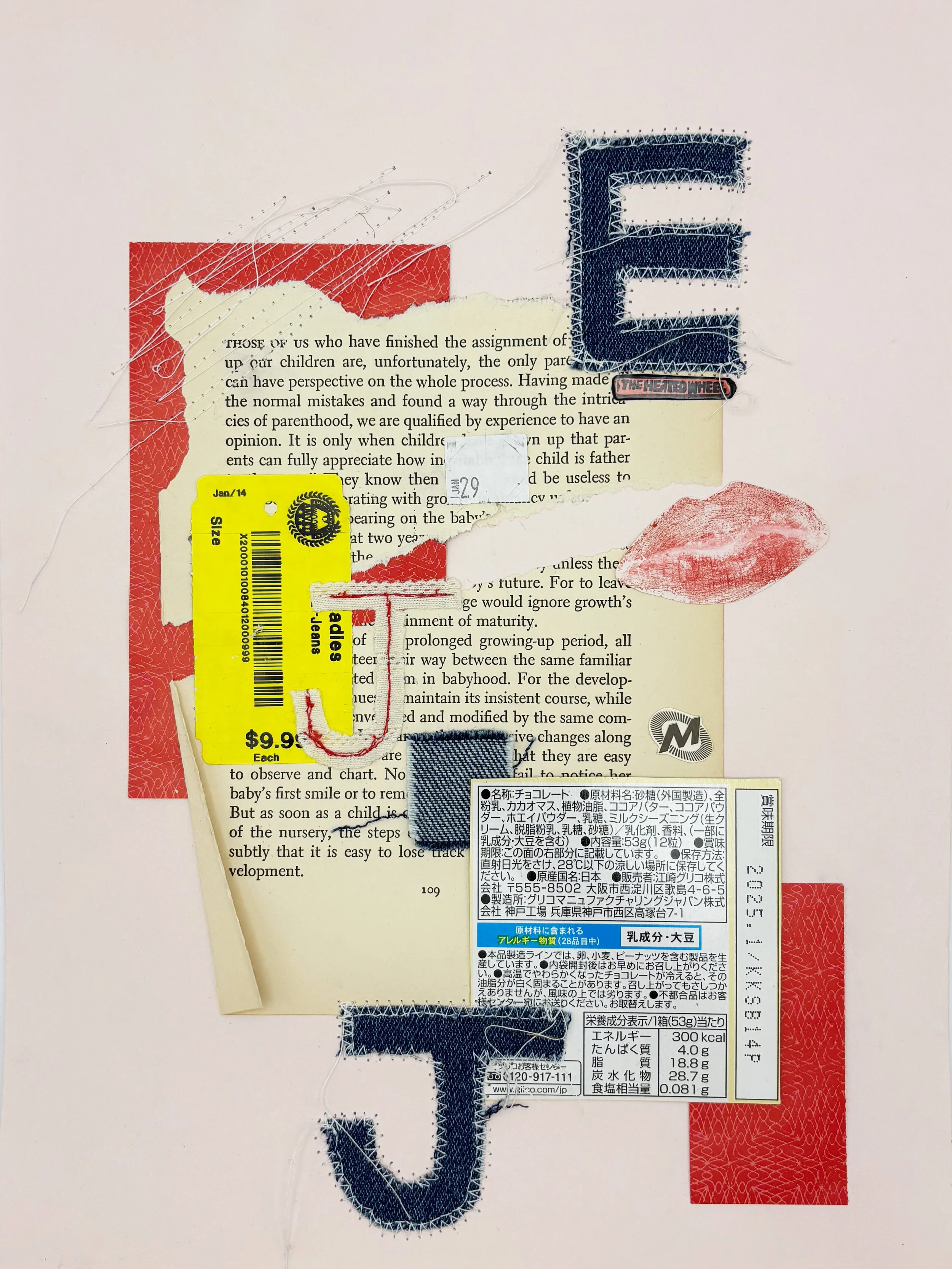
Artwork Title: Family Values
12” x 9” on Card stock with Miscellaneous Materials
I find inspiration from things around me and those I love. And I think this collage along with the ones below really capture that. One of my passions is sewing as well as collage, so why not combine them! So that’s what I did here.
Inspiration behind this piece was to take scraps and trash from around my house to create a collage representing memories with my family members. The idea was to create a juxtaposition of the trash- something that is essentially worthless to represent my family- the thing that means the most to me. Each scrap has a story behind it from each of my family members. I also added their initials and a page from a book about parenting to tie it all together.
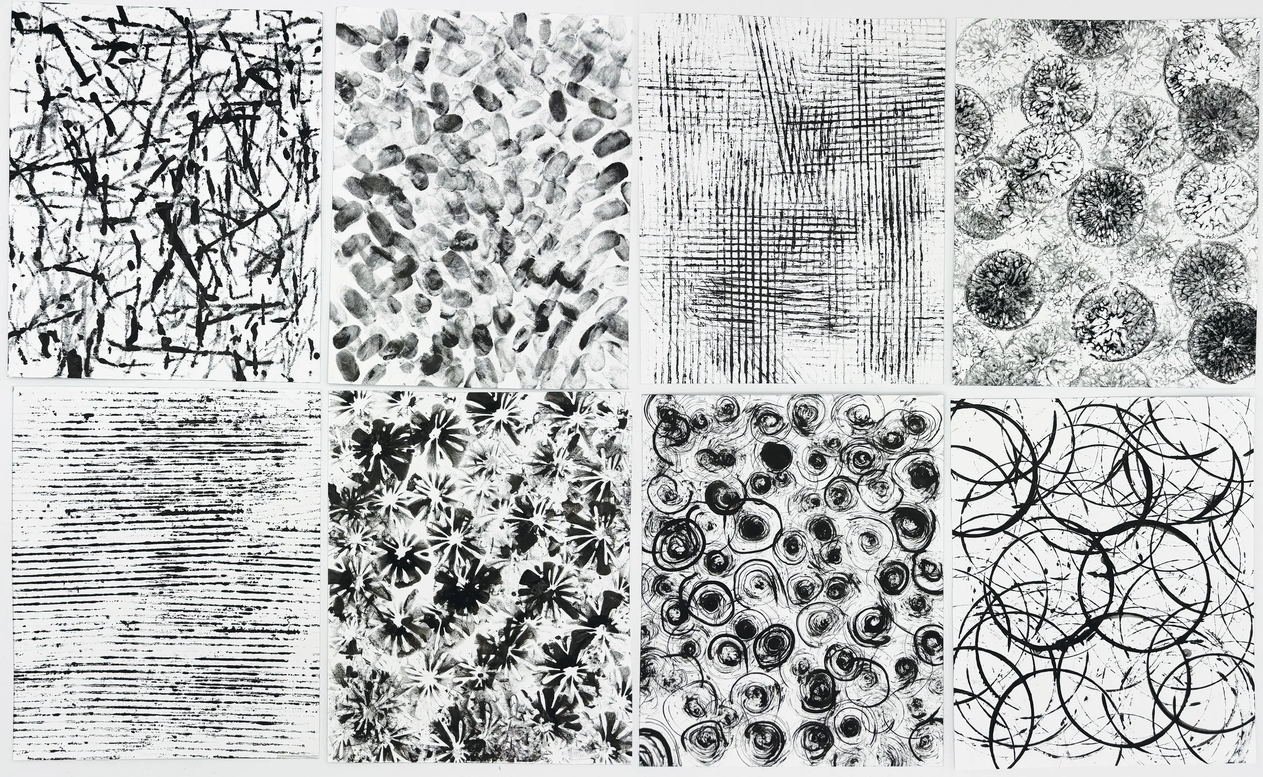
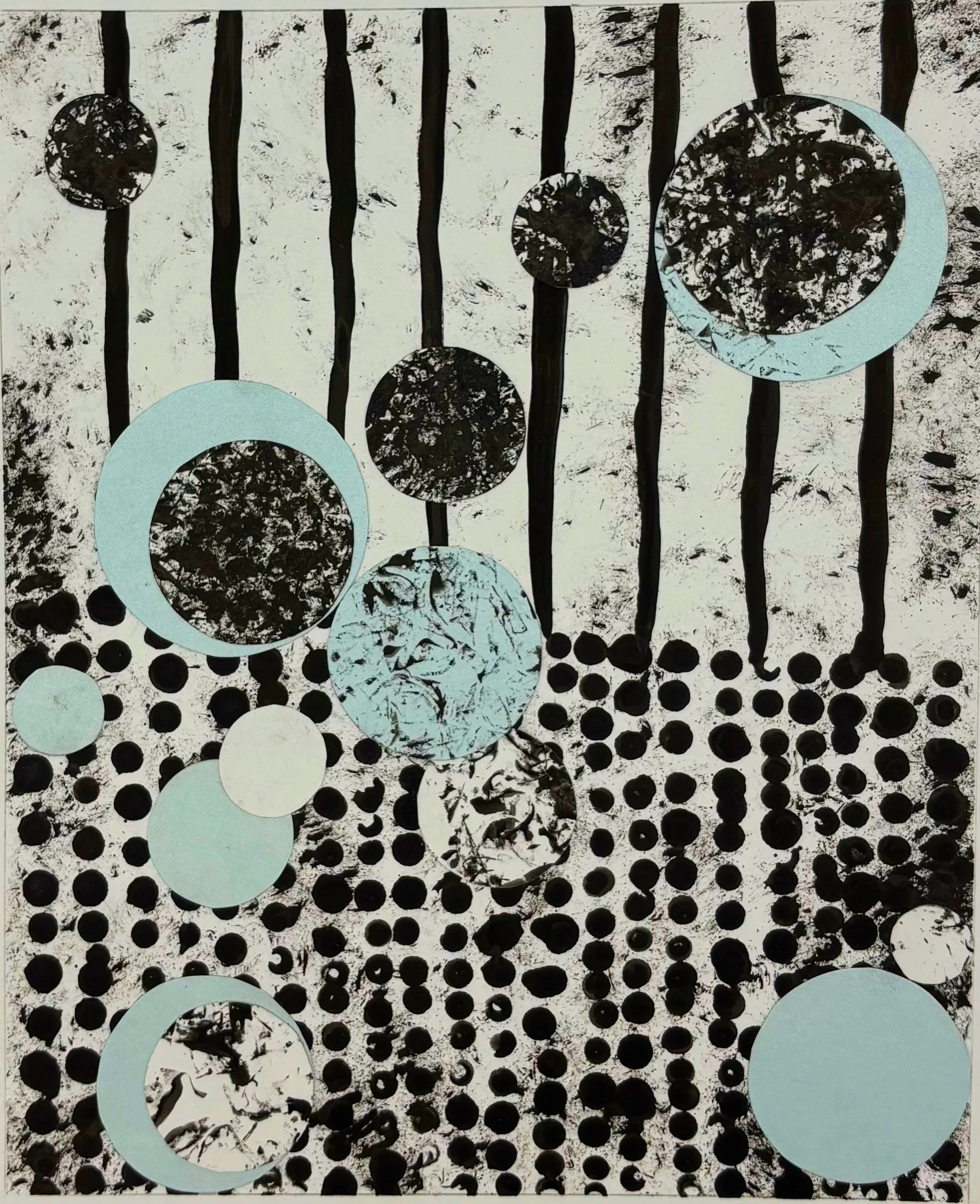
Collages done with using textures from everyday items. The inspiration behind these was to create different textures by using random found items. Many of the items I manipulated in order to achieve these textures. I used items such as ripped cardboard, a balloon with a rubber band around it, and a cut tangerine. I then used these prints to create a collage as seen above.
UXUI Design
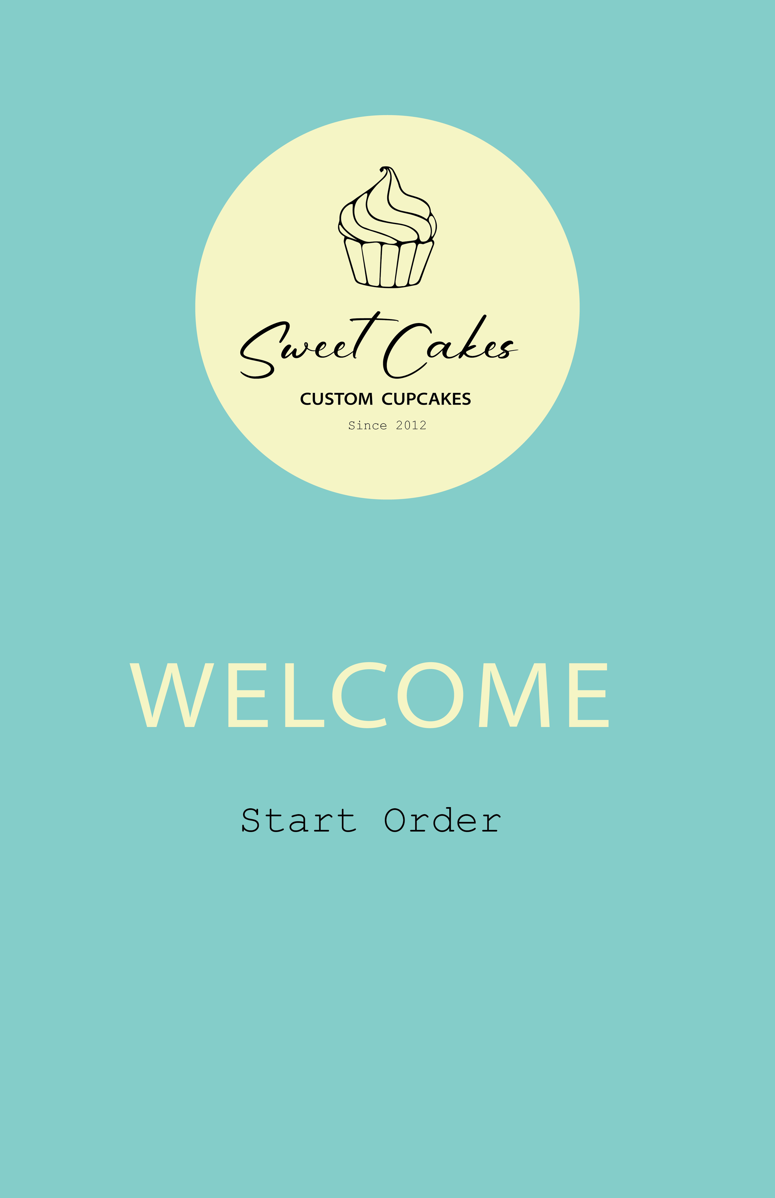
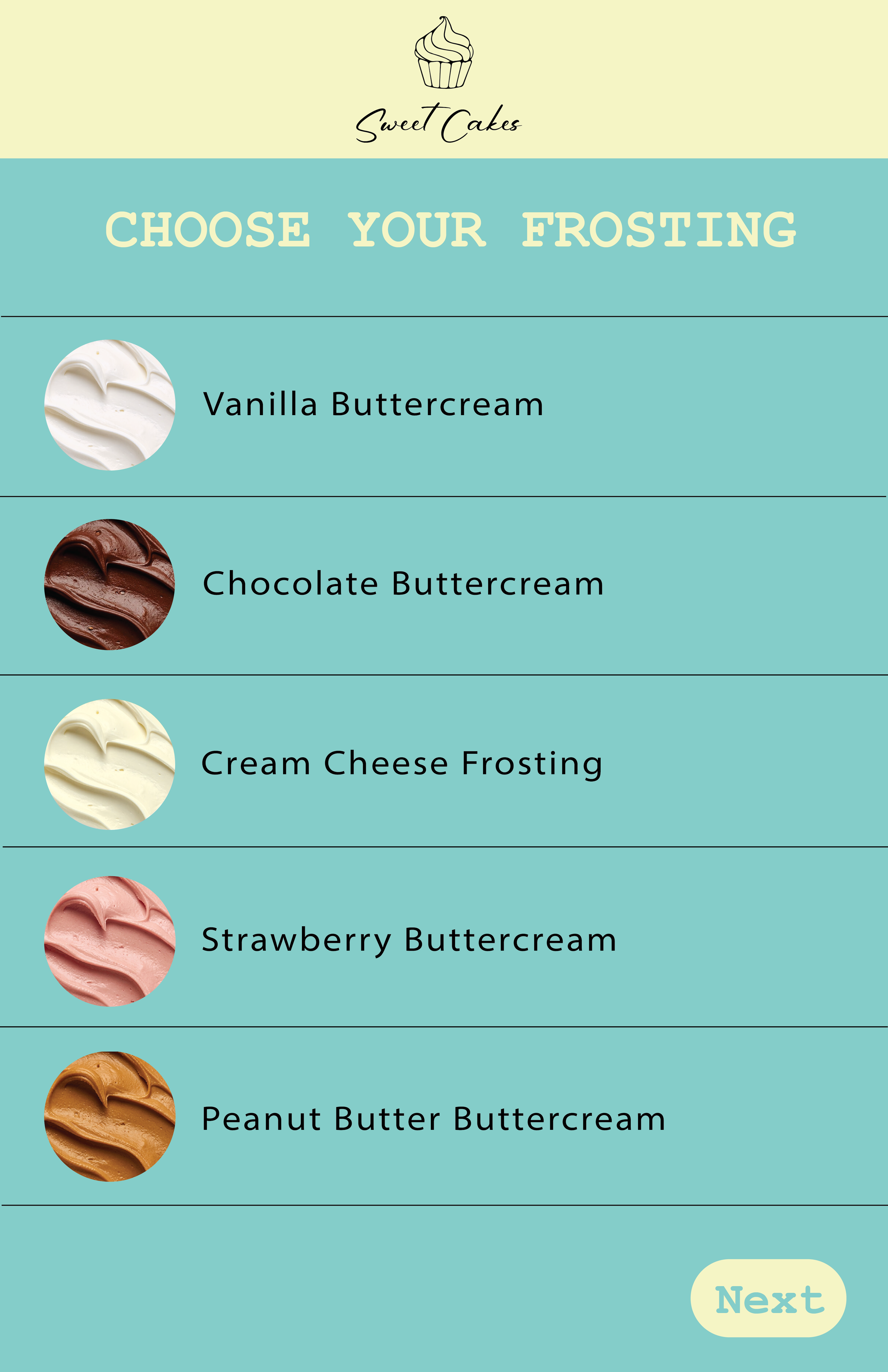
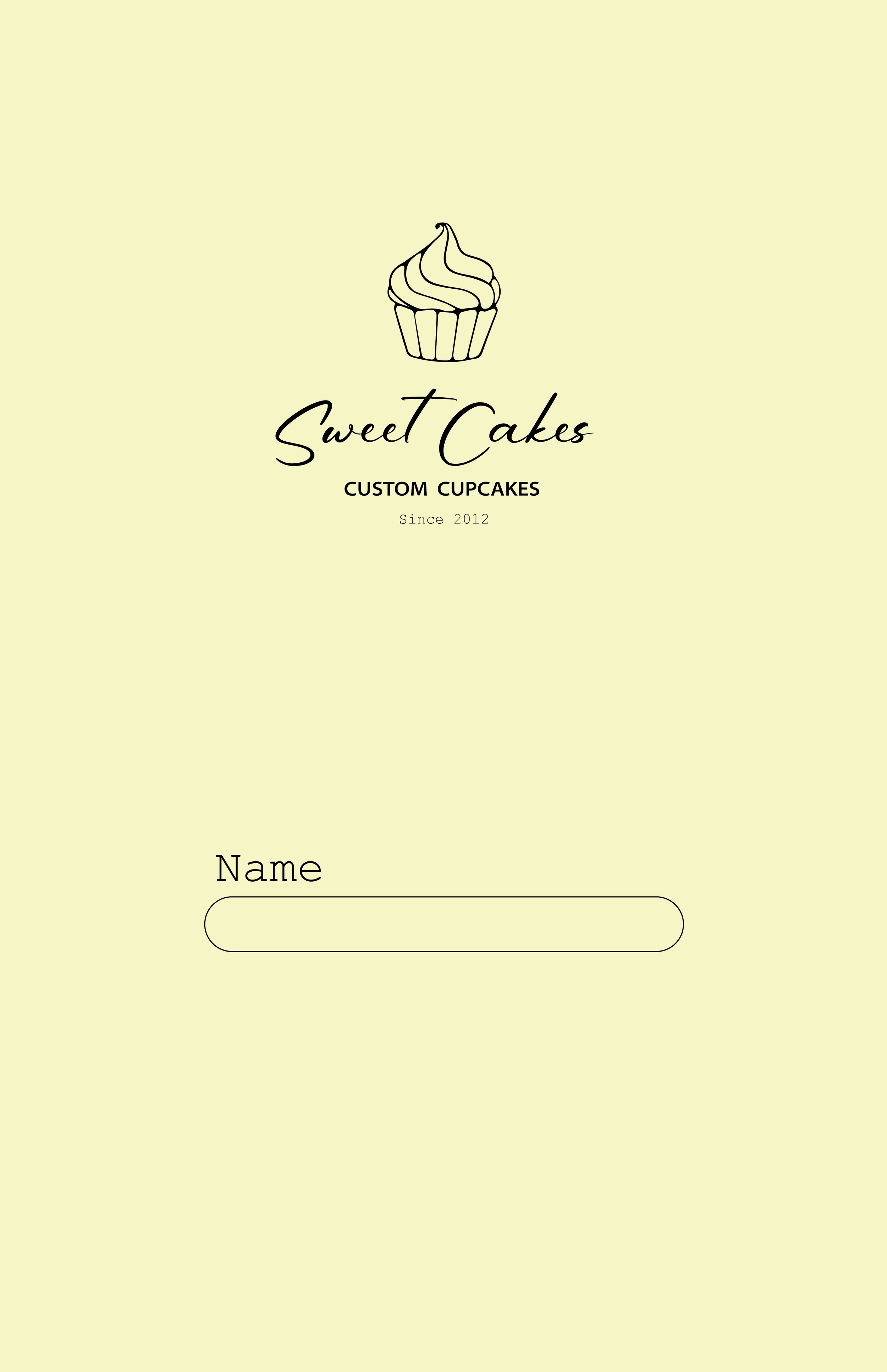
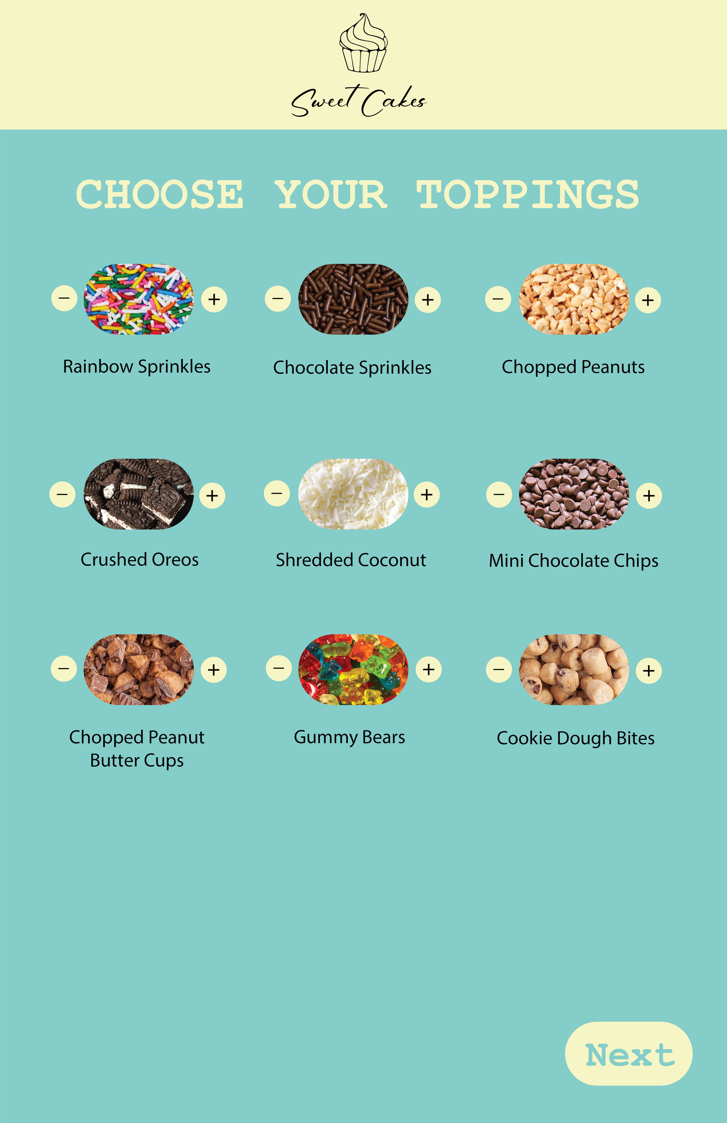
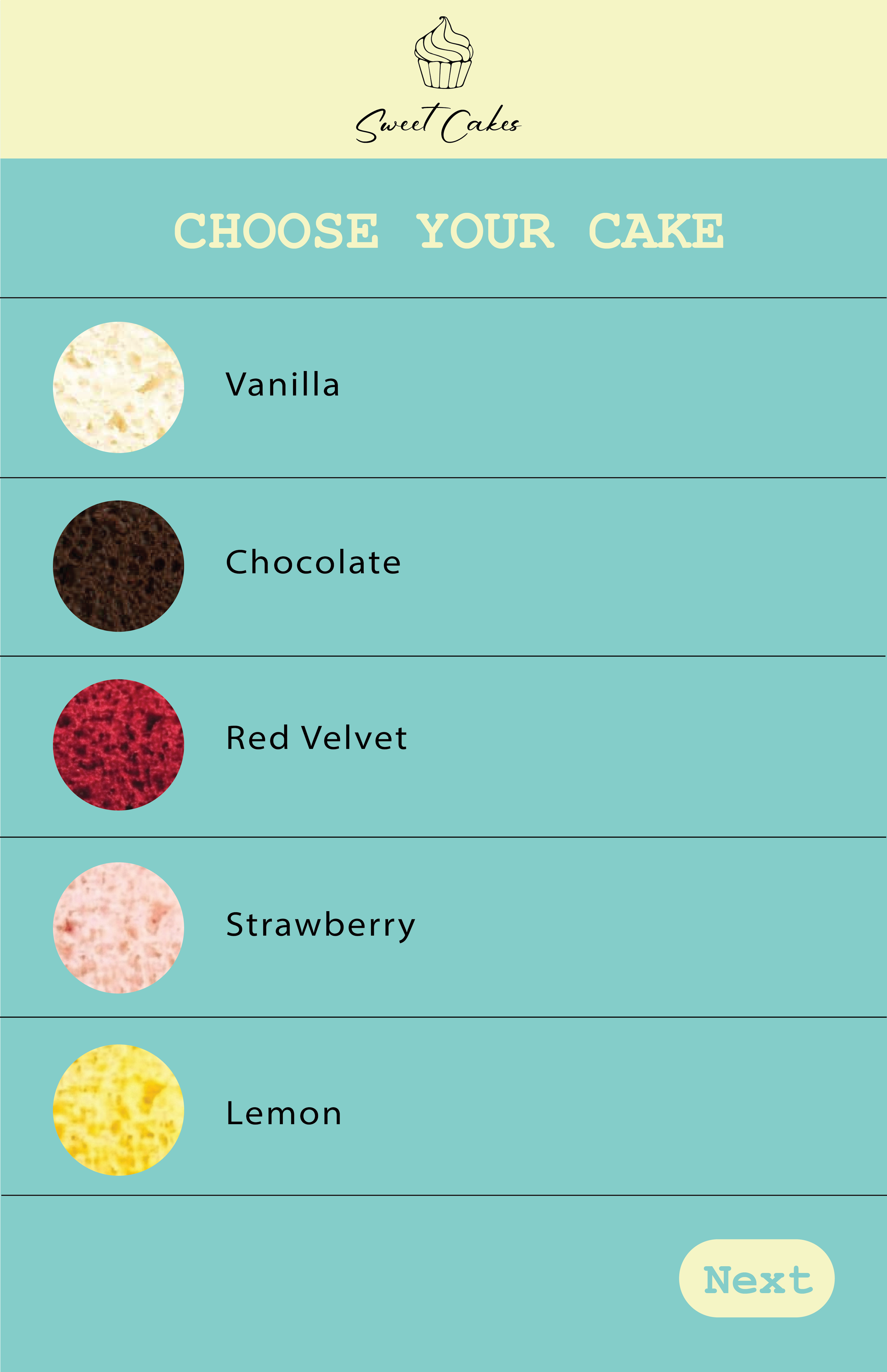
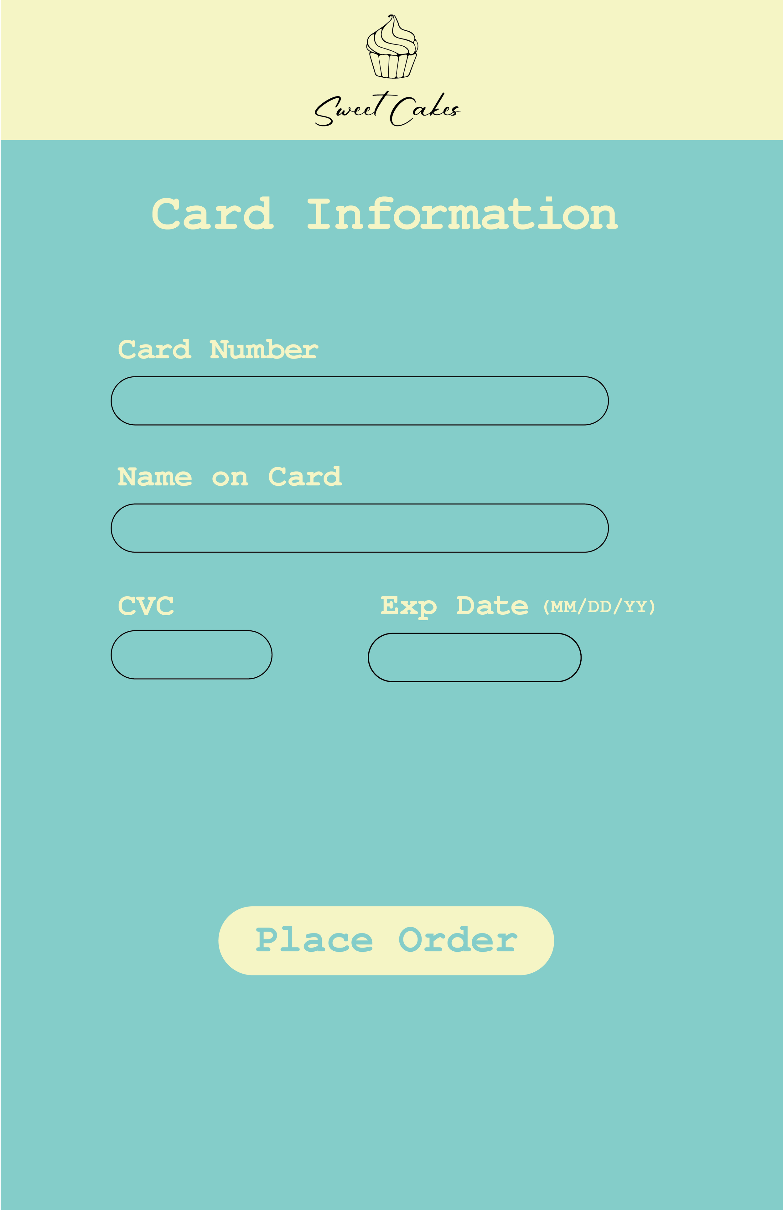
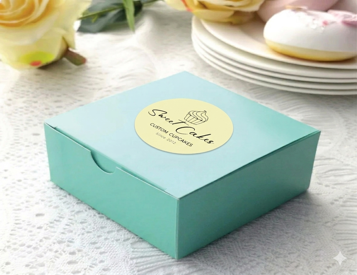
Custom cupcake ordering kiosk
This is a design for a custom cupcake ordering kiosk. It is meant to be inside a bakery as an option to order a custom cupcake. This interface allows you to pick your flavor cake, frosting, and toppings.
I wanted to keep the design simple and clean as well as the interface easy to use. I chose the color scheme because I wanted something soft and inviting, like a sweet treat. I think when it comes to food people like to see what they are getting so I chose to use imagery when selecting each element of your cupcake. For the logo a combined a script typeface for the name with both a serif and a sans serif font as subscript. I used the same fonts throughout the interface to keep consistent branding.
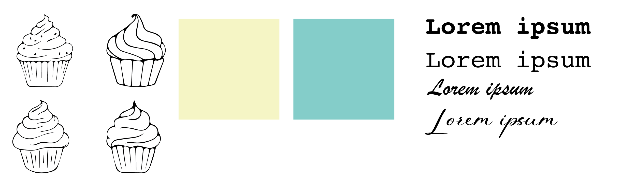
Type considerations, color pallet, and logo/icon sketches
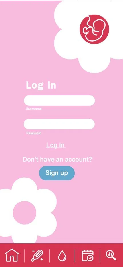
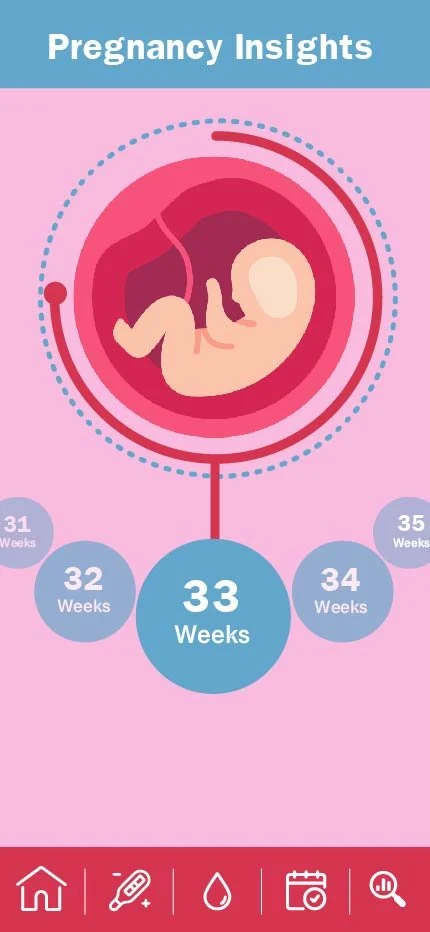
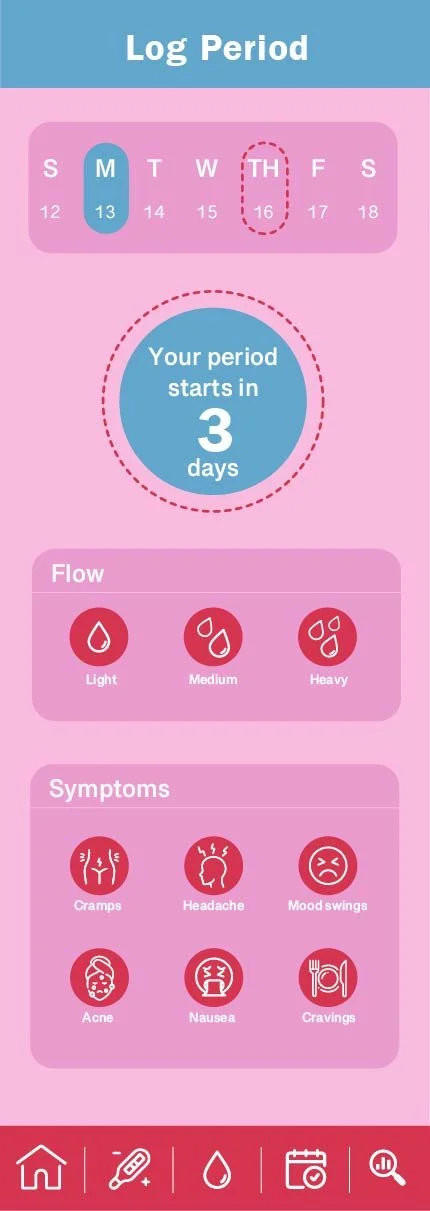
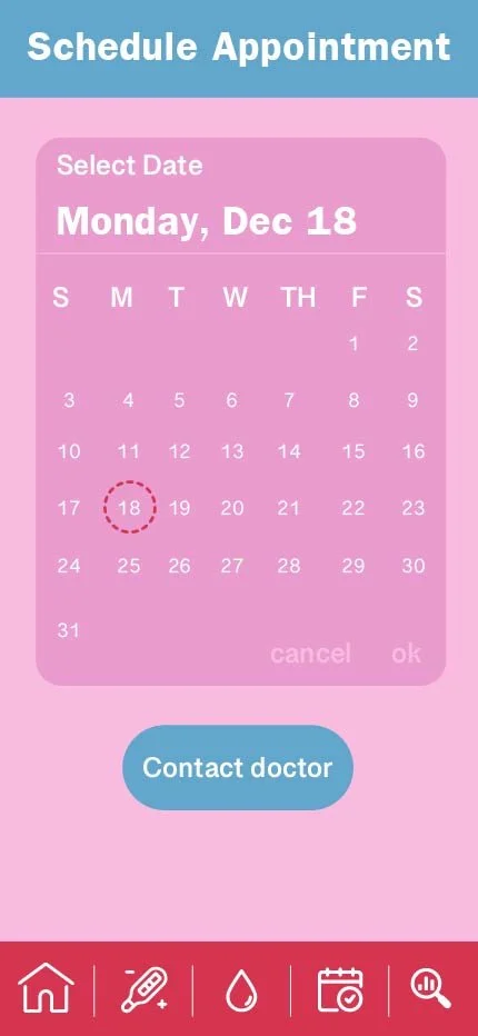
Pregnancy and period tracking app
For this project I was asked to make a hypothetical app for a pregnancy test. The idea was if you were able to connect a pregnancy test to your phone and view the results there. I also added a feature to tract your pregnancy, tract your period, as well as schedule doctors appointments. I wanted to keep the color scheme pink, blue, white, and red to represent pregnancy and menstrual cycles, but I opted for a lighter pallet easier on the eyes. Pregnancy and periods often comes with a lot of stress, so I wanted to keep the design calming and user friendly. I designed most of the layout in Adobe Illustrator then took it into Figma to prototype the app.
Gallery
Filters
No results found
No results match your search. Try removing a few filters.